Profile
Gucci Westman on the Art of Making Beauty Feel Like Yourself
Kayla M. Walker / Aug 8, 2026

Makeup artists are translating color theory into complexion-aware palettes, forcing brands to rethink undertone, value, shade architecture, and the way products are merchandised.
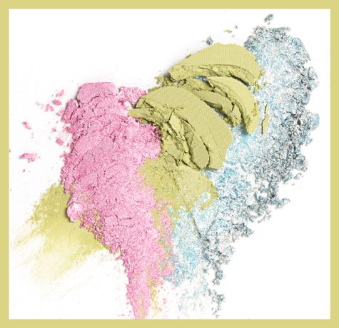
Color theory in makeup is not a wheel printed on a classroom wall. It is a set of decisions made against a living surface. Hue, value, chroma, opacity, and light change once pigment meets skin. A coral blush can look orange on one complexion and pink on another. A cool contour can read gray, violet, or simply absent depending on depth and undertone. The artist's job is to anticipate those changes before the product reaches the face.
The spring 2026 palette is especially interested in color as a connected field rather than a single accent. In Vogue's spring beauty report, makeup artist and Chanel Beauty ambassador Tasha Reiko Brown described coral, peach, and rose in soft tonal washes across the eyes, cheeks, and lips. The technique is not a demand for one shade on every feature. It is a lesson in proportion. The same color family can be adjusted in value and opacity so that the face reads as one composition.
Artists begin with the surface because makeup color is perceived in relation. The amount of natural redness, the depth of the skin, the presence of olive or golden tones, and the finish of the base all affect the color that follows. A blush that is too close in value to the complexion may vanish. A high-chroma pigment may sit on top of the skin instead of joining it. A neutralizing product can change the result before the visible color is even applied.
Research supports the limits of casual shade matching. A study published in Color Research & Application examined how individual skin tone affects preference for liquid foundation colors. Another study in Color Research and Application's cosmetics literature examined how foundation color changes after application and how cosmetic experts classified undertones. The lesson is straightforward: a shade name or a digital swatch is not the same thing as a finished color on a face.
That is why complexion-aware palette design cannot stop at a light-to-deep scale. It needs undertone logic and a range of intensities. A palette for deeper skin may require higher pigment load and enough value separation for blush, highlight, and contour to remain visible. A palette for very fair skin needs colors that do not become stark simply because the formula is highly concentrated. The goal is not to create separate aesthetics for different customers. It is to make the same artistic idea legible across different surfaces.
The commercial translation is visible in foundation ranges. Fenty Beauty's complexion guide lists 50 shades for one of its foundation offerings and describes new shades added to cover a wider range of undertones. L'Oréal Paris says its True Match range matches 98 percent of UK female skin tones. These are brand claims, not a universal measure of inclusion, but they show how shade architecture has become part of the product's public argument.
The next question is whether color products receive the same thought. A complexion range can be broad while a blush or bronzer range remains organized around a narrow idea of what color is visible on skin. Artists solve this through mixing, placement, and controlled opacity. Brands can solve more of it at the product level by designing shades with different chroma, finish, and undertone behavior, then showing those differences on a range of complexions.
Multipurpose color makes the architecture more demanding. A cream pigment intended for eyes, cheeks, and lips must account for the different optical requirements of each area. On the eyes, a shade may need buildable opacity. On the lips, it must interact with the natural color of the lip. On the cheek, its finish and undertone may decide whether the result looks flushed, sculpted, or bruised. The formula can be flexible, but the merchandising needs to teach the customer how to use that flexibility.
The usual palette display privileges the pan. The artist's display would privilege the relationship: the shade against the complexion, the shade beside its neighboring tones, and the finish under more than one light source. Swatches should show sheer and built-up applications. Digital shade finders should explain depth and undertone without pretending a phone camera has solved color science. Product pages should show enough complexions for a shopper to see how value and chroma travel across skin.
This is not only a service improvement. It changes how inventory works. A palette with six near-identical midtone shades may photograph well but create confusion at the shelf. A range with deliberate relationships can support cross-selling: a warm blush beside a neutral bronzer, a brightening corrector beside a deeper contour, or a tonal eye shade that echoes the lip without matching it exactly. The customer sees a system rather than an isolated color.
The artist's influence is strongest when it leaves room for judgment. Brown's tonal washes are useful because they describe a method, not a compulsory face. Color theory gives brands a way to build the method into the product, but it cannot remove the need for observation. Skin changes with light, season, hydration, and the finish of the products already on it.
Seasonal color can start the conversation, but complexion-aware architecture is what makes it sell honestly. When brands treat undertone, value, and finish as design inputs, the palette becomes an instrument for the artist's eye. When they do not, color theory remains decoration on the package.